Introduction
Sass mixins allow you to group CSS declarations and reuse them throughout your stylesheets. When you use a mixin, the declarations it contains are inserted at the point in the code where the mixin is called. In this blog post, we’ll discuss the basics of Sass mixins, how to create them, and how to use them.
What are Sass Mixins?
Sass mixins are groups of CSS declarations that can be reused throughout your stylesheets. Mixins enable you to write less code, and make your stylesheets more organized and maintainable. You can think of a mixin as a “container” for a set of related declarations.
Creating Sass Mixins
Creating a Sass mixin is simple. All you have to do is define a set of related declarations and give it a name. The syntax for defining a mixin is as follows:
@mixin [mixin-name] {
	[declarations]
}
For example, the following mixin defines a set of declarations to create a basic button:
@mixin button {
	padding: 10px;
	border-radius: 5px;
	background-color: #000;
	color: #fff;
	font-weight: bold;
}
Great, mixin declared!
Using Sass Mixins
Once you’ve defined a mixin, you can use it in your stylesheets by calling the mixin with the @include keyword. The syntax for calling a mixin is as follows:
@include [mixin-name]
For example, if you wanted to use the button mixin you created earlier, you would write:
.my-button {
	@include button;
}
Pretty neat, huh?
Now, let’s look at how you can use Sass mixins to make your code even more DRY. By using parameters, you can pass values to mixins, allowing you to create more generic mixins that can accept different values. This makes it easier to customize the mixin without having to define multiple mixins.
Arguments
Arguments are variables that are passed to a mixin when it is called. These arguments allow you to customize the mixin without having to define multiple mixins. The syntax for defining a mixin with arguments is as follows:
@mixin [mixin-name] ([arguments]) {
	[declarations]
}
When calling the mixin, you can pass values to the arguments like this:
@include [mixin-name] ([argument1], [argument2], etc.)
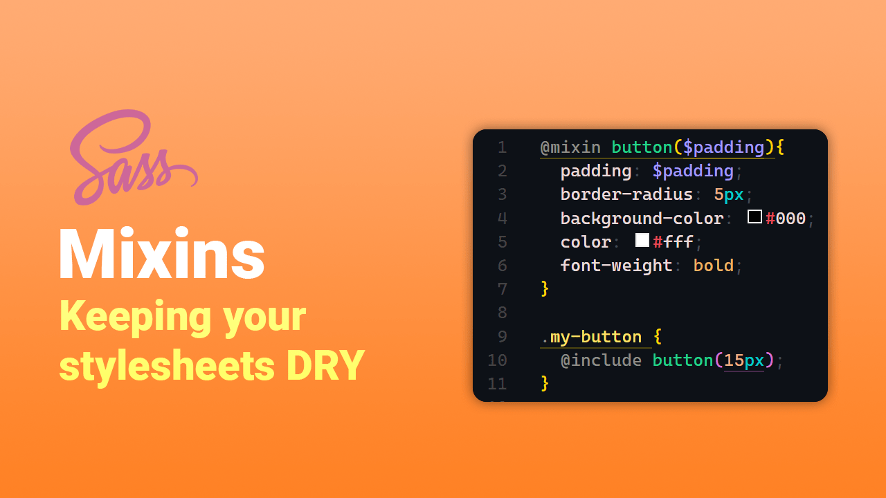
For example, if we wanted to use our button mixin with different padding, we could do this:
@mixin button($padding){
	padding: $padding;
	border-radius: 5px;
	background-color: #000;
	color: #fff;
	font-weight: bold;
}

.my-button {
	@include button(15px);
}
This would generate the following CSS:
.my-button {
	padding: 15px;
	border-radius: 5px;
	background-color: #000;
	color: #fff;
	font-weight: bold;
}
Optional Arguments
You can also make arguments optional by providing a default value. This allows you to create mixins that can be customized, but will still work if the argument is not passed in. For example, if we wanted to make the background color of our button mixin optional, we could provide a default value like this:
@mixin button($padding, $background-color: #000) {
	padding: $padding;
	border-radius: 5px;
	background-color: $background-color;
	color: #fff;
	font-weight: bold;
}
Now, if we call the mixin without passing in a value for the background-color property, it will use the default value:
.my-button {
	@include button(padding: 20px);
}
The generated CSS will look like this:
.my-button {
	padding: 20px;
	border-radius: 5px;
	background-color: #000;
	color: #fff;
	font-weight: bold;
}
Keyword Arguments
You can also use keyword arguments when calling mixins to make your code more readable. With keyword arguments, you can assign the argument values when calling the mixin, instead of having to pass in the values in the same order as the mixin’s arguments. For example, if we wanted to use the button mixin with keyword arguments, we would write:
.my-button {
	@include button(padding: 10px, background-color: #000);
}
You can learn more about Mixin Arguments here!
Content Blocks
Content blocks are another way to make your mixins more versatile. Content blocks allow you to pass in additional declarations that will be inserted into the mixin. To use a content block in a mixin, you have to use the @content directive. The syntax for defining a mixin with a content block looks like this:
@mixin [mixin-name] {
	[declarations]
	@content
}
When you call the mixin, you can pass declarations to the content block, like this:
@include [mixin-name] {
	[additional declarations]
}
For example, if you wanted to add additional declarations to the button mixin you created earlier, you could do this:
@mixin button($padding, $background-color: #000) {
	padding: $padding;
	border-radius: 5px;
	background-color: $background-color;
	color: #fff;
	font-weight: bold;
	@content;
}

.my-button {
	@include button(20px) {
		font-size: 16px;
		line-height: 24px;
	}
}
This would generate the following CSS:
.my-button {
	padding: 20px;
	border-radius: 5px;
	background-color: #000;
	color: #fff;
	font-weight: bold;
	font-size: 16px;
	line-height: 24px;
}
Nice!
Conclusion
Sass mixins are a great way to write DRYer code and keep your stylesheets organized. By defining a set of related declarations as a mixin, you can easily reuse them throughout your stylesheets. Mixins also make it easier to maintain your stylesheets, since you can update a single mixin instead of making the same change in multiple places.
We’ve touched on the basics of mixins, but you can find the full breakdown in the Sass documentation here.


